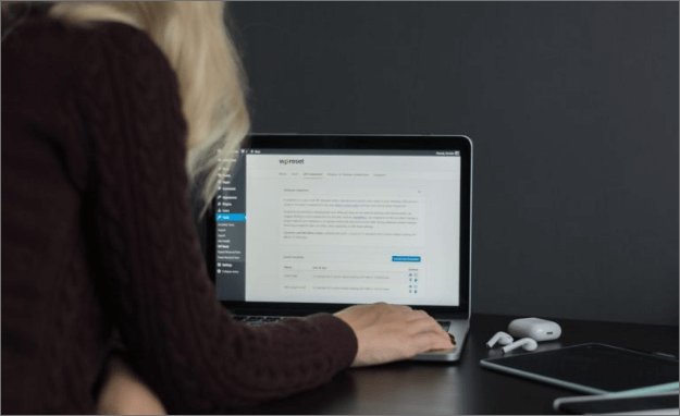
If you are reading this you probably need a website done and need help writing website copy, you might be thinking about hiring someone possibly to do it, or you want to tackle doing in on your own. In whichever case any web designer or digital consulting company will tell you to first GO WITH A WORDPRESS WEBSITE! If you are not sure about domain and hosting… please refer back to this blog post here.
Does the word website make you feel stressed?
Not knowing if you have the right website content on there? Not knowing what sections or design to have? BUT MOST IMPORTANTLY, how do we make your customer actually want to take action on your website? HERE ARE A COUPLE TIPS!!!
TIP 1 : Remember the average person stays on a website for 15 seconds and leaves. So in that window of time you have to make yourself or your brand stand out visually and the content on there has to be GOOD! We are going to go over the first couple of tips right now!
TIP 2: Have a good HEADLINE in the first section of your website!!!

Let’s see some examples
Option 1: Must describe what you do
If I have a dog shop, then my headline would say either 1. Your dog just got a new favorite store or
2. We sell high quality dog products
When we refer to headlines it has to be like our second photo in this post
Let’s look at some more examples:
For example, UberEats uses “Your favorite food, delivered with Uber” Short and sweet and to the point. Speaks to the customer and answers what they do.. they DELIVER FOOD!
TIP 3: Keep it short
One of the most common mistakes of web copy is that it is too long. RULE OF THUMB: OVER 1 INCH… IT IS TOO LONG! There have been several studies showing people read a lot less on the web and will leave a site if they cannot find what they are looking for. Pages that scroll and scroll are unlikely to be read. Instead place a link to a downloadable .pdf file or a see more button.
TIP 4: Icons enhance copy
Design elements can significantly increase the power of your copy. It is quicker for a user to recognise a section of copy if there is an icon associated with it. This also has advantages for users with cognitive difficulties who can use the icons as a guide. Do not go overboard but when used discreetly icons can improve your copy and the usability of your website as a whole.
What do you do in your company/business? Let’s practice together and brainstorm together!!! Tell me in the comments below… your “What do I do”!!
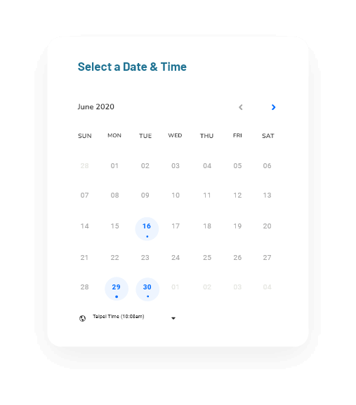
Don’t forget to book a FREE clarity call where
I’ll be happy to answer any and all of your questions!!!
Book a call here: https://calendly.com/shawna-30/30min

